Wrong Grid (part 1)
Choosing the wrong grid can undermine your analysis, mislead your audience, and make you look foolish.
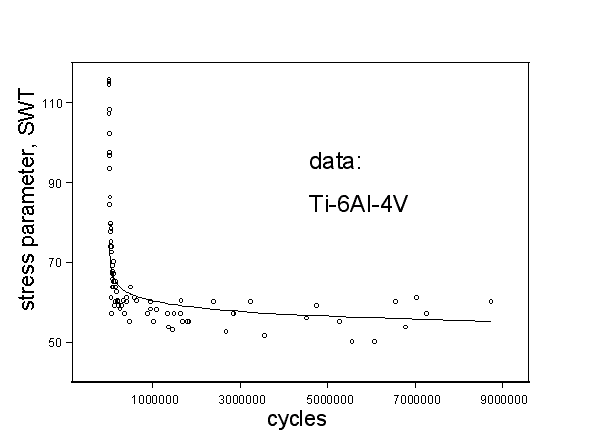
I’ve claim to have devised this wonderful new material model for describing s-N (stress, cycles) fatigue behavior. As you can see in Figure 1, for Ti-6AL-4V data, at large N, the model goes through the data, and at smaller N, makes a dramatic upward turn, as the data do, and again tracks the data quite well.

Figure 1, “New” model describes the data “wonderfully.”
Or does it?
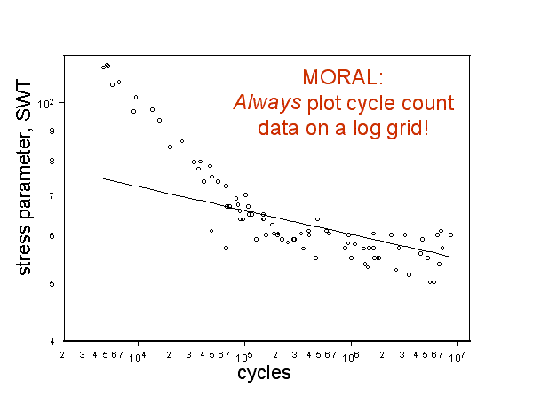
To those familiar with fatigue data, the Cartesian axis for cycle count, N, is a poor choice because it obscures most of the interesting behavior. Any knowledgeable fatigue analyst would ask to see the “wonderful new” model presented on more appropriate axes, as fatigue data are ALWAYS shown logarithmically. Figure 2 presents the same data, and the “wonderful new” model on more appropriate axes.

Figure 2, Model performance can be obscured by choice of grid.
It is immediately evident that my “wonderful new” model is rubbish. It only looked good to those unfamiliar with fatigue data. For high stress (small N, where I had claimed such remarkable agreement) the error could be two orders of magnitude or greater.
Employing a Cartesian grid inappropriately would lead those familiar with the topic to believe that I was either ignorant, for not knowing any better after presenting myself as being knowledgeable, or a charlatan for trying to hoodwink my audience.

