
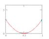
PLOT the DATA!
We have a data sample and need its upper and lower bounds.
X <- c(18.00, 3.86, 16.60, 7.69, 16.00, 4.06, 3.82, 56.30, 145.00, 2.92, 2.97, 10.60, 206.00, 9.12, 8.50, 31.20, 37.30, 29.70, 72.20, 8.08, 35.90, 5.93, 17.10, 73.00, 61.60, 47.00, 58.60, 18.70, 33.80, 25.00, 19.30)
Everyone knows ±2 standard deviations from the mean encloses 95% of the sample, so compute the sample mean and standard deviation, and the bounds are \(\bar X + 2 \hat \sigma\).
The bounds are correct IF the sample is from a Normal distribution. Is it? Did you check? Have you made a VALID statistical calculation that is FALSE? (See 2+2=5)
Step 1: PLOT the DATA:
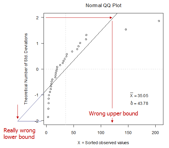
These observations are NOT normal because they do not fall on a straight line on a Normal QQ plot. When you compute a mean and standard deviation, this is what you are doing whether you realize it or not.
The bounds are clearly wrong. Since these observations are skewed right, maybe a log transform would help.
log.X <- c(2.89, 1.35, 2.81, 2.04, 2.77, 1.40, 1.34, 4.03, 4.98, 1.07, 1.09, 2.36, 5.33, 2.21, 2.14, 3.44, 3.62, 3.39, 4.28, 2.09, 3.58, 1.78, 2.84, 4.29, 4.12, 3.85, 4.07, 2.93, 3.52, 3.22, 2.96)
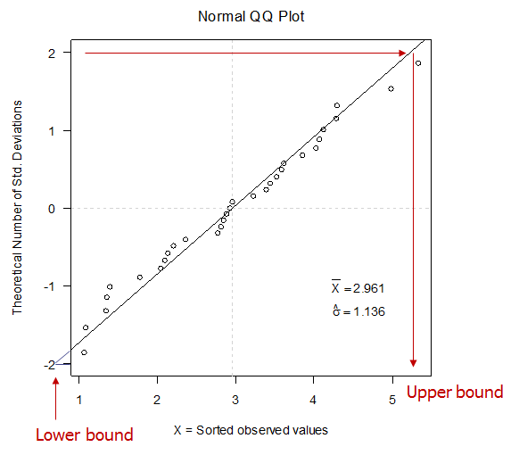
These data are well-described by a Normal distribution as evidenced by their proximity to a strainght line.
WARNING:
While Normal and LogNormal distributions are very common they are not the only possibilities. A QQ plot can be constructed for any distribution by plotting on the y-axis the distirbution’s “Q” (quantile) function, analagous to number of standard deviatoins from the mean for the Normal plot.
How to make a QQ Plot:
You will need R, the world’s best data analyisi software, and it’s free! Download the Windows binary files from the R website, http://www.r-project.org/. To do that click on CRAN (Comprehensive R Archive Network) and choose a mirror site in the US (or wherever is closer). From the CRAN page, click on Windows (95 and later) then click on base to download the R base package. Install R using the self-install feature of what you have downloaded.
Here is the R-code for constructing simple Normal QQ plots that I used for these figures. Cut & Paste into an R session.
QQ.plot <- function(X){
windows(width = 5.8, height = 5.8, pointsize = 12, xpos = -140, ypos = 100)
par(mar = c(4.5, 4.5, 2.5,1 ) + 0.1, las = 1)
y.min <- -2
y.max <- 2
x.min <- min(X)
x.max <- max(X)
X.bar <- mean(X)
stdev <- sd(X)
cat(paste("\nX.bar =",signif(X.bar, 4)," stdev =", signif(stdev, 4),"\n"))
sorted.X <- sort(X)
npts <- length(X)
Q.theoretical <- qnorm(p=(1:npts)/(npts+1))
plot(sorted.X, Q.theoretical, axes = TRUE, xlim = c(x.min, x.max), ylim = c(y.min, y.max),
 xlab = "X = Sorted observed values", ylab = "Theoretical Number of Std. Deviations")
mtext("Normal QQ Plot", line = 1, side = 3, cex = 1.2)
x.loc <- par("usr")[1] + 0.8*(par("usr")[2] - par("usr")[1])
y.loc <- -1
text(x.loc, y.loc, bquote(bar(X) == .(signif(X.bar, 4))))
y.loc <- -1.3
text(x.loc, y.loc, bquote(hat(sigma) == .(signif(stdev, 4))))
abline(h = 0, lty = 2, col = "light gray")
abline(v = X.bar, lty = 2, col = "light gray")
abline(a = -X.bar/stdev, b = 1/stdev)
}
Before you can run the code you need to enter the data. Cut and paste this line into the R session:
log.X <- c(2.89, 1.35, 2.81, 2.04, 2.77, 1.40, 1.34, 4.03, 4.98, 1.07, 1.09, 2.36, 5.33, 2.21, 2.14, 3.44, 3.62, 3.39, 4.28, 2.09, 3.58, 1.78, 2.84, 4.29, 4.12, 3.85, 4.07, 2.93, 3.52, 3.22, 2.96)
To run the code type: QQ.plot(log.X) and hit <Enter>
If you find this code helpful, send me a note. Tell me what you’re working on.
Best Wishes!